Typography Trends: Crafting A Modern Look For Your Website
Let’s talk about making your website look modern with cool text styles. Think of this as giving your site a fresh outfit that grabs everyone’s attention. Typography is more than just picking pretty letters; it helps people find their way around your site, makes your brand stand out, and can even make visitors feel something special.
Now, there are some new trends in typography that you should know about to stay ahead. These include bold statements at the top of pages, fonts that look like they were drawn by hand, classic serifs from old books popping up again, and fun effects like animation.
In 2023 alone, we’ve spotted six big trends such as these that designers use to make websites pop.
These trends do more than just look good; they help folks read and understand your content better on all kinds of devices – phones, tablets, or computers. Plus, when done right with colors and effects or by mixing different fonts together smartly – poof! You’ve got yourself a site that not only looks amazing but also tells your story clearly.
We pair fonts like best friends to create stunning web pages and sprinkle in some custom designs too so people know it’s really you. Using Lato? That’s a font known for playing nice with others on websites!
Remember this: using cool text styles isn’t just fancy dressing—it’s powerful for building trust with those who visit your website. Let’s explore how we can do all this together!
Understanding the Importance of Typography in Web Design
After diving into the latest in modern typography, let’s talk about why type matters so much on your website. Good typography guides peopleas they look through your site. It makes sure they find what they need without getting lost or confused.
When we pick just the right fonts and layout text well, it can make a big difference to how folks feel when they visit your website.
Think of letters like a map for the eyes. A clean and clear set helps people move from point A to B smoothly, understanding what you want them to know fast. Typography isn’t just about making words look nice; it tells users which bits are most important and sets the mood of your space online.
We use smart type choices to build trust with visitors, showing that our brand is solid and we care about their experience on our site.
Top Typography Trends for Crafting a Modern Website

Crafting a modern website requires staying on top of current typography trends. From bold hero text to left-aligned typography, these design elements can make a significant impact on the overall visual appeal of your website.
Let’s explore how you can incorporate these trends into your web design to create a contemporary and engaging experience for your audience.
Bold Hero Text
We know the power of first impressions. That’s why we use bold hero text to catch our audience’s eyes right away. Imagine your website greeting visitors with super bold titles that pop out and say, “Here I am!” This kind of attention-grabbing text isn’t just for looks—it tells people what you’re about in a glance.
Think about those really big, impactful words at the top of a webpage; they’re like the strong handshake of web design elements. We make sure these super-sized messages are front and center so no one can miss them.
With hero headers set in italic typography or even more experimental styles, your site’s main message becomes unforgettable.
Let’s keep things fresh and exciting on our websites with bold statements that stand out. Using these trendy, modern web design twists shows we mean business—and helps us stay ahead in this fast-moving digital world.
Hand-drawn Fonts
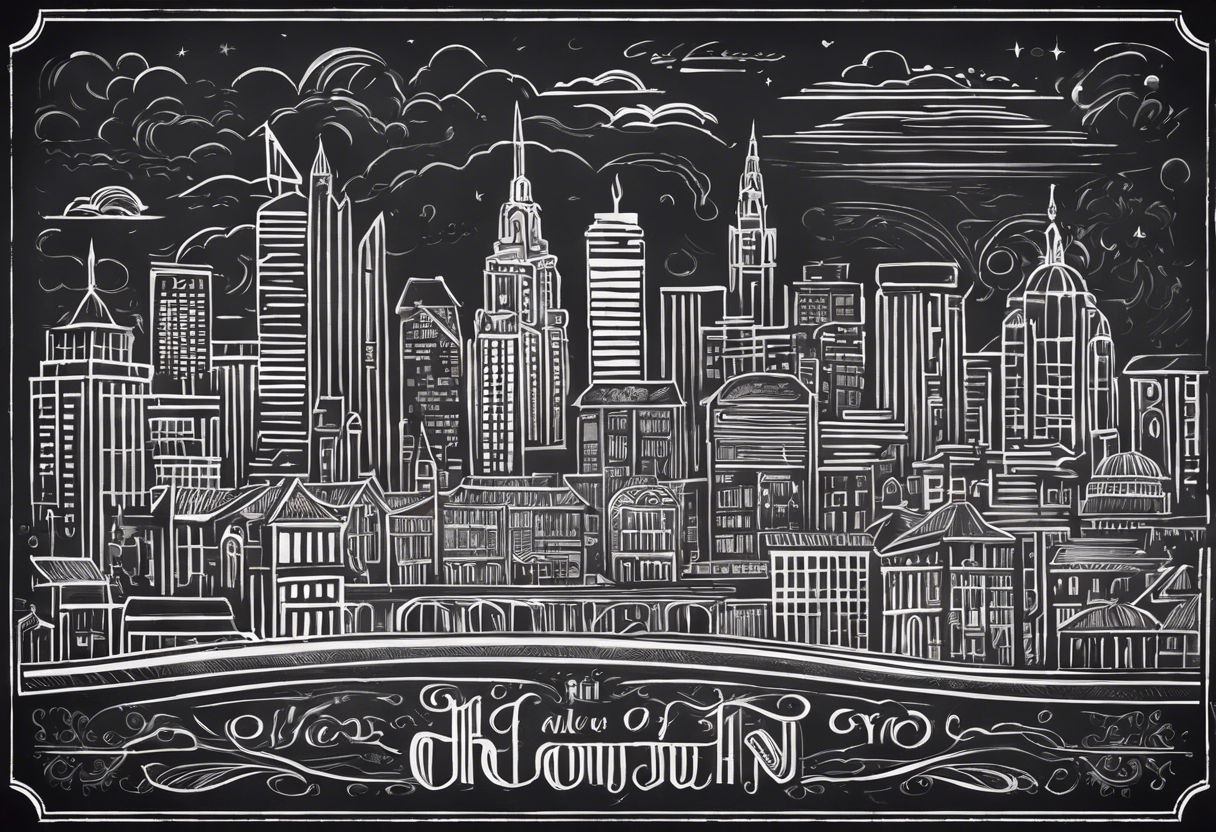
Hand-drawn fonts are becoming a big trend in modern website design. They add a personal touch that makes your site stand out. These typefaces give the feel of real handwriting or custom lettering, which can make your business look unique and friendly.
Many hand-drawn fonts start from actual pen-on-paper creations, showing the artist’s own style.
You might see these playful letters on menus for cafes or on pages selling handmade goods where warmth is key. Some companies use digital tools to tweak stock fonts into something that looks hand-crafted.
This mix of old-school calligraphy with new tech brings a fresh yet familiar vibe to websites. Hand-drawn fonts bridge the gap between traditional art and graphic design, making them perfect for businesses looking to show off their creativity.
Let’s talk about another trend that’s shaking up web typography: Serifs Making a Comeback.
Serifs Making a Comeback

Serifs, you know those little lines at the ends of certain letters? Well, they’re making a comeback in modern website design. This trend brings a touch of tradition to your website while adding a refreshing twist.
As a business owner, using serifs in your typography can create an atmosphere of modern nostalgia and help your brand stand out.
The use of serifs adds a sense of authority and timelessness to your website’s visual identity. It’s not just about following trends; it’s about leveraging the emotional connection that comes with blending tradition with contemporary design.
Outlining Fonts

As we explore the realm of modern typography trends, it’s fascinating to note how serifs are making a comeback in web design. Embracing this resurgence, another captivating trend is the use of outlining fonts to create visually striking text designs.
The combination of outline and condensed fonts with regular typography designs injects a sense of dynamism into website layouts.
An intriguing fact guiding this trend is its reflection in over 30 typography trends for 2024. This includes innovative experimentation as designers blend outline and condensed fonts with traditional typographic styles, resulting in fresh and unique textual aesthetics for websites.
Left-aligned Typography
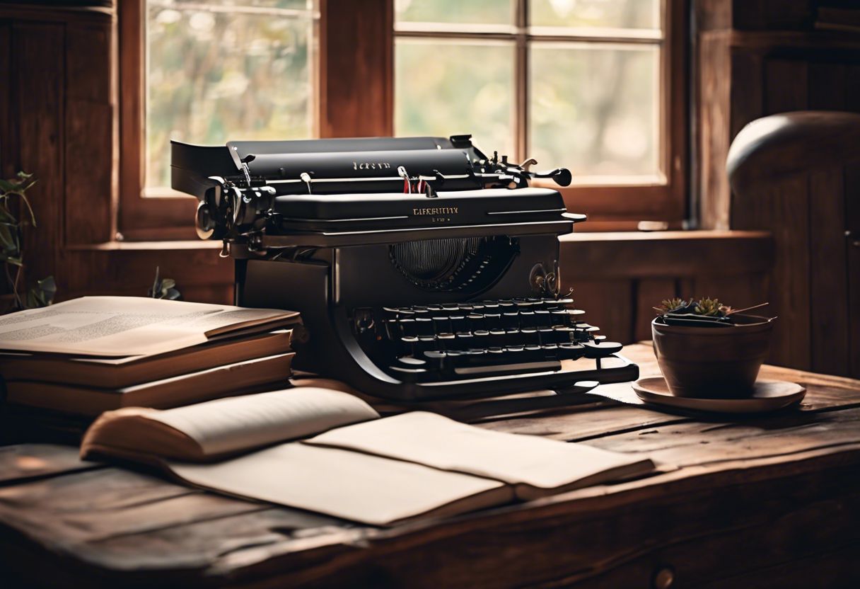
Left-aligned typography is a key trend for crafting a modern website. It enhances readability and brings elegance to the text. By aligning your text to the left, you create a clean and sophisticated look, which is appealing to visitors.
This simple adjustment can significantly impact the overall visual appeal of your website.
Additionally, left-aligned text can improve the reading experience for users. When text is aligned to the left, it becomes easier for readers to track from one line to another. Furthermore, this alignment complements other design elements on the page, creating a balanced and harmonious layout that captures attention effectively.
Embracing left-aligned typography in your web design can elevate the professionalism and attractiveness of your site while ensuring ease of reading for all visitors. With its elegant appearance and improved readability, it’s an essential aspect of modern web typography trends.
Enhancing Readability and Accessibility
Choosing the right fonts for your website is crucial in enhancing readability and accessibility. By optimizing typography for different platforms and designing with accessibility in mind, you can ensure that all users have a positive experience on your site.
Choosing Legible Fonts

When selecting fonts, consider the following to ensure readability and accessibility:
- Typeface Selection: Opt for clear and legible typefaces that are easily readable at various sizes and on different backgrounds to enhance user interface accessibility.
- Font Size and Line Height: Use an appropriate font size and line height to improve readability. These factors greatly influence the overall legibility of your content, aligning with user interface accessibility best practices.
- Color Contrast: Ensure strong contrast between font and background colors for optimal legibility, promoting visual hierarchy and enhancing the overall accessibility of your design project.
- Font Hierarchy: Establish a clear font hierarchy within your design by using different font sizes to emphasize the importance of information, ultimately improving readability and ensuring user interface accessibility.
- Consistency in Design Aesthetics: Maintain consistency across your choice of fonts throughout your website for improved aesthetics and to reinforce brand identity, contributing to a cohesive visual experience for users.
Optimizing Typography for Different Platforms

After carefully choosing legible fonts that enhance readability, the next step is optimizing typography for different platforms. This ensures that your chosen fonts are easily readable on various devices and screen sizes.
Font selection plays a crucial role in this optimization process to ensure that text remains clear and legible across all platforms, from desktops to mobile devices. Screen readability is essential, and it’s important to consider responsive design when selecting typefaces and determining text size.
Furthermore, optimizing typography involves ensuring proper color contrast to improve accessibility standards and user experience. Typeface legibility can be enhanced by adjusting the color of the font against its background, making it easier for users with visual impairments to consume content comfortably.
By focusing on these aspects of typography optimization, you’ll not only improve the aesthetics of your web design but also enhance usability across different platforms for a wider audience reach.
—
Designing with Accessibility in Mind
When designing a website, it’s crucial to prioritize accessibility. By choosing legible fonts and optimizing typography for different platforms, you can ensure that all users, including those with visual impairments and neurodiversity, can consume your content easily.
Accessible Rich Internet Applications (ARIA) can be used to design more inclusive digital experiences.
Incorporating accessible design practices not only caters to a wider audience but also aligns with ethical and legal considerations. Designing with accessibility in mind enhances user experience, promotes inclusivity, and helps elevate brand identity by demonstrating a commitment to serving all customers.
By embracing accessible typography trends, we can create a more welcoming online environment for everyone, regardless of their abilities or disabilities. This approach fosters an inclusive digital landscape where every individual feels valued and empowered.
Innovative Typography Techniques

Combining Fonts for Emphasis, Text Animations and Effects, and Color Fonts and Highlighted Lettering are just a few of the innovative typography techniques that can take your website to the next level.
Discover how these techniques can elevate your design in our upcoming blog post.
Combining Fonts for Emphasis

We, as business owners, should master the skill of combining fonts for emphasis. This skill is essential for creating a visually appealing and modern website. Let’s explore some effective techniques to combine fonts for emphasis:
- Consider the personality of each typeface when combining fonts. Aim for a balance of extroverted and reserved styles to create visual interest and harmony within your typography.
- Match the attributes of your intended message with font choices. This alignment ensures that your typefaces effectively convey the mood and tone you want to express on your website.
- Understand font psychology and the effects of different font styles. Informed decisions regarding font combinations can significantly impact how your website influences moods and drives user choices.
- Select appropriate typefaces that bring out the best in each other when paired together. Each font should complement the other while maintaining its individuality to create a cohesive design.
- Explore typeface combinations that enhance readability and accessibility for all users, ensuring that your combined fonts are legible across different platforms and devices.
- Experiment with innovative typography techniques such as text animations, color fonts, or highlighted lettering to draw attention to specific content on your website.
- Continuously refine your font pairing skills by seeking inspiration from contemporary typography trends while staying true to your brand identity and messaging goals.
Text Animations and Effects

After combining fonts for emphasis, another way to make your website stand out is by incorporating text animations and effects. These innovative typography techniques can add dynamism and visual interest to your web design.
The use of animated text manipulation, such as typewriter or glitch effects, can create a cutting-edge and interactive user experience. By integrating dynamic text animation into your website, you can captivate visitors and convey information in an engaging manner.
In 2023, interactive web design trends include various forms of visual effects such as animated words, horizontal scroll, and other experimental typography effects. These techniques not only grab attention but also enhance the emotional impact of typefaces on users.
Color Fonts and Highlighted Lettering
Moving from text animations and effects to another striking trend in typography, color fonts and highlighted lettering take center stage in modern website design. The use of color fonts and highlighted lettering is an innovative technique that captivates attention and adds a vibrant touch to your web content while enhancing the visual appeal.
Incorporating colorful fonts can effectively convey brand personality, evoke emotions, and help establish a memorable identity for your business. It’s essential to remember that font color plays a crucial role in communicating your message authentically, as it impacts readability and draws the audience into the content.
The right application of color fonts can create a powerful impact on how users perceive and engage with your website. Utilizing captivating hues in highlighted lettering not only attracts attention but also guides users through essential information or calls-to-action within your site.
However, it’s important to note that excessive use of colored fonts or highlighting might overwhelm visitors or even detract from the overall user experience if not thoughtfully implemented.
Font Harmony: Perfect Pairings for Stunning Web Design

Crafting a modern website involves choosing fonts that complement each other to create an appealing visual hierarchy. When it comes to font pairing, Lato, a versatile sans serif font, is perfect for conveying both titles and body text.
Additionally, creating harmony and emphasis with typography aids in elevating the overall aesthetic appeal of your website. One way to achieve this is by selecting complementary fonts featuring clear contrast and hierarchy.
This ensures that your font pairings are visually stunning while maintaining readability for your audience.
Innovative typography techniques can further enhance your web design efforts by combining fonts for added emphasis or incorporating text animations and effects. Moreover, utilizing color fonts and highlighted lettering can add a unique touch to your website’s visual identity.
By carefully considering font harmony in your web design strategy, you can elevate the overall user experience while reinforcing brand identitythrough consistent typography across various branding elements.
Using Typography to Elevate Brand Identity
Typography plays a crucial role in creating and maintaining brand identity. By customizing fonts and ensuring consistency across branding elements, businesses can establish a strong visual identity that resonates with their target audience.
This section explores how typography can be used to elevate brand identity, setting the stage for a deeper understanding of its impact on web design.
Customized Fonts
When it comes to creating a unique and memorable brand identity, customized fonts play a vital role. The font choices we make can convey the personality, values, and professionalism of our brand.
It’s important to understand that proper font choices can influence how customers perceive our brand. By selecting the right custom fonts, we have the opportunity to portray our brand’s character and history through typography, ultimately creating a cohesive and visually appealing brand image.
Using Shopify custom fonts also presents an opportunity to convey our brand’s personality and values through typography. This helps in crafting a unique and appealing visual identity for our business.
Consistency Across Branding Elements
Customized fonts can truly elevate the visual identity of a brand. Now, let’s delve into maintaining consistency across branding elements, particularly in typography. Consistent typography across various platforms helps in establishing trust with users and reinforcing brand values.
When brands maintain uniformity in their typeface, visual identity becomes stronger, ultimately leading to enhanced user engagement and customer loyalty.
Consistency in typography extends beyond just the choice of fonts; it encompasses factors such as design guidelines, logo design, color scheme, and website design. Establishing clear brand guidelines for typography is crucial since it forms an integral part of a brand’s visual identity.
Conclusion
In conclusion, embracing modern typography trends is crucial for crafting a visually appealing website. By incorporating bold hero text, hand-drawn fonts, and left-aligned typography, businesses can elevate their online presence.
Choosing legible fonts, optimizing typography for different platforms, and prioritizing accessibility are essential for enhancing readability. Furthermore, combining fonts for emphasis and utilizing innovative techniques like text animations can help create a stunning web design that aligns with the brand’s identity.
Font harmony through perfect pairings and customized fonts ensure a cohesive and impactful visual appeal across branding elements.
Discover how the right combination of fonts can transform your website’s aesthetic with our guide on font harmony and perfect pairings for stunning web design.
FAQs
1. What is typography and why is it important for a website?
Typography refers to the style and appearance of printed matter. It’s important for a website as it affects readability, user experience, and visual appeal.
2. How can I choose the right font for my website to create a modern look?
To create a modern look, consider using sans-serif fonts, experiment with different weights and sizes, and ensure the chosen font aligns with your brand’s identity.
3. Can I mix different fonts on my website for a modern typographic look?
Yes, but it’s important to maintain harmony by using contrasting styles, such as pairing a serif font with a complementary sans-serif font to create visual interest without overwhelming the design.
4. Are there any current trends in typography that can give my website a contemporary feel?
Incorporating bold typography, asymmetrical layouts, variable fonts, and creative use of spacing are trendy techniques that can give your website a contemporary feel.
5. What impact does modern typography have on user engagement?
Modern typography enhances user engagement by creating an aesthetically pleasing interface that conveys information effectively while reflecting the brand’s identity.


