Whitespace Wonder: Aesthetics And Balance In Web Design

We’re talking about whitespace in web design, and it’s not just empty space. It’s the area between design parts that makes everything look good and easy to read. Whitespace can be any color and goes by another name: negative space.
It’s all about making websites simple, clean, and fancy.
Whitespace is key for a great website. It helps people enjoy using the site more, makes words easier to read, and lets them understand better what they see. Fancy sites often use lots of whitespace to look extra nice.
When we use whitespace the right way, it helps us focus on important things like buttons that say “Click here!” We also make sure everything looks good on big screens and small phone screens too.
We need to balance little spaces inside things with big spaces around stuff so our designs feel just right—not too crowded or too empty.
Using whitespace well can help guide visitors’ eyes where we want them to go on a webpage. We learn from looking at top-notch websites that do this really well.
Let’s explore how we can make our own sites awesome with the power of whitespace!
Understanding Whitespace and Its Importance

Whitespace is the empty space between design elements, and it plays a crucial role in creating balance and harmony. Embracing whitespace can enhance the visual appeal of a website, making it easier for users to navigate and engage with the content.
Definition of Whitespace

Whitespace in web design is all about the empty spaces. Think of it like breathing room for all your website’s parts, such as text, buttons, and pictures. Just because we call it “white” doesn’t mean it has to be white.
The color isn’t important—it’s all about the clear space that helps everything else look good and easy to understand.
This blank space isn’t just there for looks; it makes sure things don’t get too crowded and helps visitors find their way around your site easily. We use padding, margins, and gutters to create this space between elements.
It gives each part of your content enough air so that customers can focus on what matters most without feeling overwhelmed.
Now let’s dive into why simplicity in design matters and how you can achieve an elegant look with the strategic use of whitespace.
The Aesthetics of Simplicity
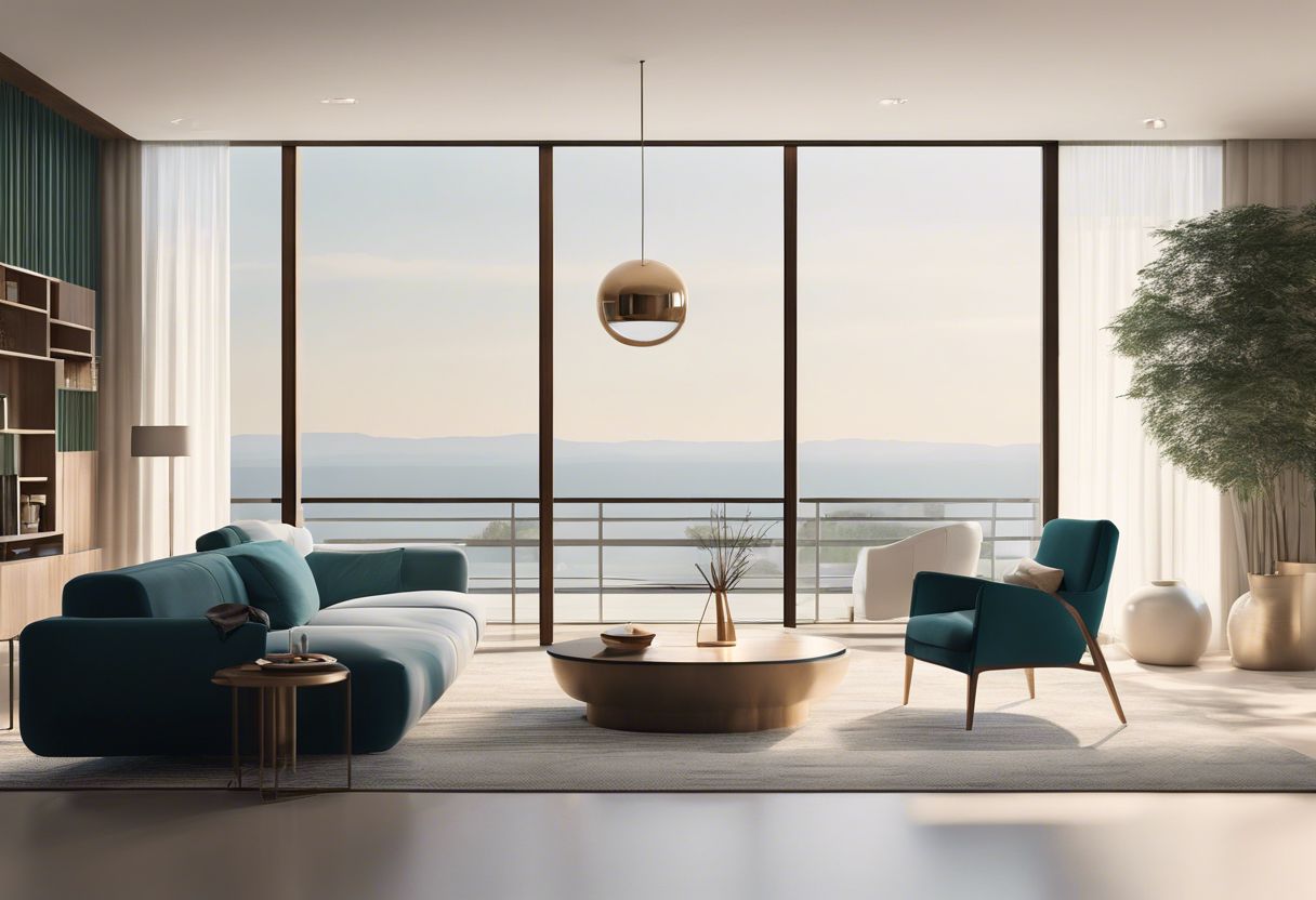
Now let’s talk about how simplicity can make a website look good. Simple designs often give off a feeling of elegance and clean design, just like a well-organized room feels peaceful.
Spaces on a webpage that are left empty on purpose help to create an open space that lets the eyes relax. They give everything on the page breathing room so nothing feels squished together.
This makes it easier for you folks who visit your website to find what they’re looking for.
A spacious design can show off your content without distractions. It creates visual balance and draws attention to important parts of your site, like call-to-action buttons or key messages about your business.
Think of minimalism in art – less is more! A simple yet powerful layout leaves plenty of room for essential elements to stand out, which might be just what you need to impress potential customers and keep them coming back.
Using negative space wisely puts the focus right where you want it while making sure the whole site has an uncluttered layout. Every bit of content gets its own spotlight, promoting better understanding and keeping visitors interested in what you have to say or sell.
Remember, elegant simplicity isn’t just about looks – it’s also smart business sense, allowing users to navigate with ease and feel good about spending time on your web page.
The Benefits of Using Whitespace in Web Design

Whitespace in web design offers numerous benefits, including enhanced user experience, increased content legibility, improved comprehension, and a perceived sense of sophistication and luxury.
These advantages contribute to creating an aesthetically pleasing and balanced website that is visually appealing and easy to navigate.
Enhanced User Experience
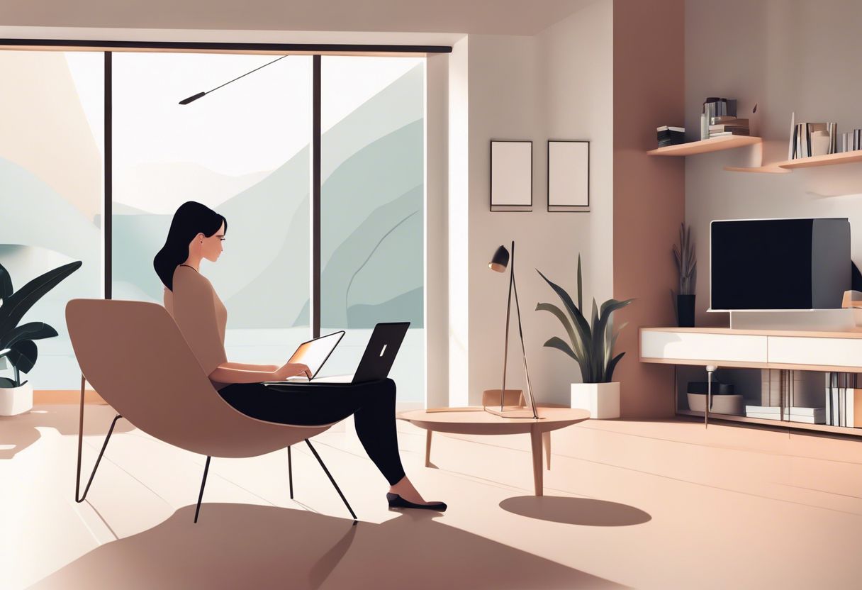
We know that a website should be easy to use and look good. Whitespace helps a lot with this. It makes your site feel open and clean, like a well-organized room. This space lets customers find what they need without getting lost or feeling overwhelmed.
Imagine walking into a shop where everything is easy to spot, and you can move around freely. That’s how whitespace works online. It creates an inviting space for visitors to explore easily, making them happy to stay longer and more likely to come back.
We aim for this kind of user-friendly interface because it turns visitors into fans of your business’s website.
Increased Content Legibility

Enhanced user experience goes hand in hand with increased content legibility. The use of whitespace significantly enhances the readabilityof your website’s content, making it easier for your audience to absorb information quickly and effortlessly.
By incorporating ample white space around text, you can ensure that the words stand out clearly and are easy to read, especially for those accessing your website on larger screens.
Increased content legibility directly leads to better text visibility and improved visual appeal. With clearer text and enhanced content clarity, visitors can easily grasp the message you intend to convey.
Improved Comprehension

When it comes to improved comprehension, whitespace plays a crucial role in web design. By allowing content to breathe and avoiding clutter, whitespace ensures that visitors can easily scan and understand the information on a website.
According to a study, the use of whitespace significantly enhances legibility, making it easier for users to read and comprehend the content. This clean design approach directs user attention effectively, guiding them through the layout with ease while maintaining a visually balanced aesthetic that conveys sophistication and luxury.
Whitespace not only creates an appealing visual hierarchy but also aids in directing user attention where it’s needed most. As business owners seeking to optimize their online presence, understanding how negative space contributes to improved comprehension is essential for effective layout design and information architecture.
Perceived Sophistication and Luxury
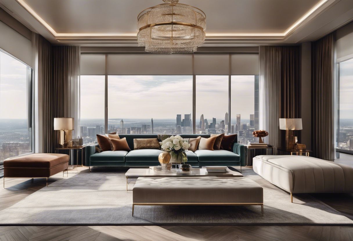
When it comes to web design, the strategic use of whitespace can elevate your website’s appearance, exuding a sense of elegance and sophistication. Websites with well-balanced whitespace create a luxurious atmosphere that leaves a lasting impression on visitors.
By incorporating clean design and a minimalist aesthetic with ample whitespace, you can achieve a high-end feel and polished look for your website, resonating with a modern and sleek audience.
Strategic utilization of whitespace contributes to the overall refined presentation of your website, conveying an elegant layout that captivates users’ attention. With larger amounts of macro white space reflecting minimalism and luxury, business owners can leverage these design elements to communicate sophistication in their online presence.
Best Practices for Utilizing Whitespace

Balance micro and macro whitespace to create visual harmony and enhance user experience. Learn how to optimize whitespace around call-to-actions for maximum impact – read on for expert tips on creating balanced web design!
Balancing Micro and Macro Whitespace

When designing a website, it’s important to balance micro and macro white space. Micro white space includes the small spaces between elements, while macro white space provides overall breathing room in the design.
Both types of whitespace are crucial for creating a harmonious layout that is visually appealing and easy to navigate. By optimizing both micro and macro white space, we can achieve a clean design with clear visual hierarchy and improved user interface.
Properly balancing micro and macro whitespace enhances the content spacing, contributing to an organized and sophisticated look. It allows for better management of visual hierarchy by ensuring that important elements stand out while maintaining an overall sense of balance in design composition.
Avoiding Excessive Whitespace

When it comes to whitespace in web design, avoiding excessive blank space is crucial. Too much empty space can make a website feel unbalanced and incomplete. It’s important to find the right balance between clean, open layouts and cluttered designs.
By following best practices and utilizing negative space strategically, business owners can create a visually appealing and effective website that resonates with their audience.
In addition to maintaining a balanced layout, minimizing excessive white space also contributes to improved user experience. When visitors are greeted by an uncluttered design with just the right amount of breathing room, they are more likely to engage with the content on the site.
Managing Visual Hierarchy
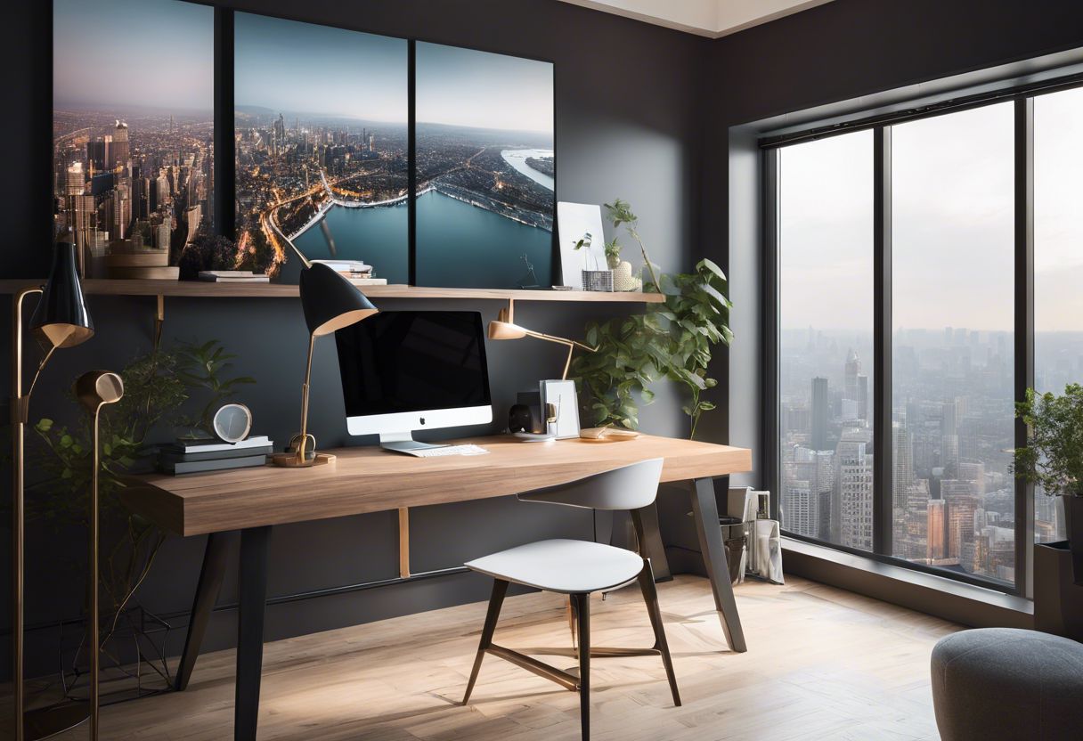
When designing a website, managing visual hierarchy through the strategic use of whitespace is crucial. This involves organizing content and elements in a way that guides the user’s eye to the most important parts of the page.
By carefully balancing micro and macro whitespace, we can create a clear visual flow that enhances user experience and overall web design appeal. It’s also essential to optimize whitespace around call-to-action buttons to draw attention where it matters most.
In addition, by understanding the principles of visual hierarchy and implementing them effectively, we can ensure that our website layout reflects a sense of balance and order, ultimately contributing to an aesthetically pleasing and user-friendly design.
Optimizing Whitespace Around Call-to-Actions

When we talk about optimizing whitespace around call-to-actions (CTAs), we’re focusing on creating a clear, uncluttered space to draw attention to these important elements. Effective use of white space around CTAs can guide visitors’ eyes, making the call-to-action more noticeable and enhancing user engagement.
By strategically placing CTAs within well-optimized white spaces, businesses can direct their audience’s attention and create a visually balanced website layout that effectively guides users toward taking desired actions.
Strategic spacing around call-to-actions is essential for maintaining visual balance, ensuring clear direction for users, and ultimately improving user interface design. With optimized whitespace around CTAs, businesses can enhance the overall aesthetic appeal of their websites while also increasing the chances of conversion through attention-grabbing design and improved user experience.
Whitespace Considerations for Mobile Devices

When considering mobile devices, it’s crucial to optimize whitespace for a seamless user experience. Mobile screens have limited space, making efficient use of whitespace essential.
We must ensure that enough clear space is maintained around elements for easy tapping and scrolling.
To enhance content legibility on mobile screens, we should balance micro and macro whitespaces carefully. Avoid excessive whitespace that can clutter the screen or make the content appear disjointed.
Managing visual hierarchy becomes pivotal on smaller screens to direct users’ attention effectively. Additionally, optimizing whitespace around call-to-action buttons enhances their visibility and increases conversion rates.
Ensuring Browser Compatibility with Whitespace Design

To ensure that whitespace design works well across different browsers, it’s crucial to consider responsive design. Responsive design helps in adjusting the layout of a website based on the screen size and orientation of the device being used.
This assists in maintaining a consistent user experience regardless of whether visitors are using Chrome, Safari, Firefox, or other browsers. Additionally, testing your white space design on various browsers can help identify any inconsistencies that need to be addressed for optimal visual appeal and functionality.
Browser compatibility is essential for ensuring that your website’s layout and visuals look as intended regardless of what browser someone is using. It contributes to a cohesive user experience and fosters professionalism.
Examples of Effective Whitespace Use in Websites

Explore how top websites leverage whitespace to create visually appealing and user-friendly designs. We’ll analyze the implementation of negative space in various website designs to understand how it contributes to a better user experience and aesthetic appeal.
Analyzing Top Websites for Whitespace Implementation
When we look at top websites for whitespace implementation, we can learn valuable lessons about how to use negative space effectively. Here are some key insights from analyzing leading websites:
- Negative Space Creates Visual Harmony: Websites with well-balanced negative space achieve a clean layout and aesthetic appeal, contributing to a clutter-free and well-organized design.
- Minimalist Design Enhances User Experience: By utilizing spacious design and balanced composition, these websites prioritize user-friendly experiences, leading to improved comprehension and increased content legibility.
- Strategic Use of White Space: These examples demonstrate the importance of managing visual hierarchy and optimizing white space around call-to-actions for maximum impact.
- Ensuring Compatibility: The analyzed websites showcase effective whitespace considerations for mobile devices, ensuring that their design choices cater to diverse browsing habits and preferences.
- Exuding Elegance: The elegance and sophistication conveyed by the balanced white space in these websites create positive impressions on visitors, aligning with the perceived luxury of well-designed spaces.
Conclusion
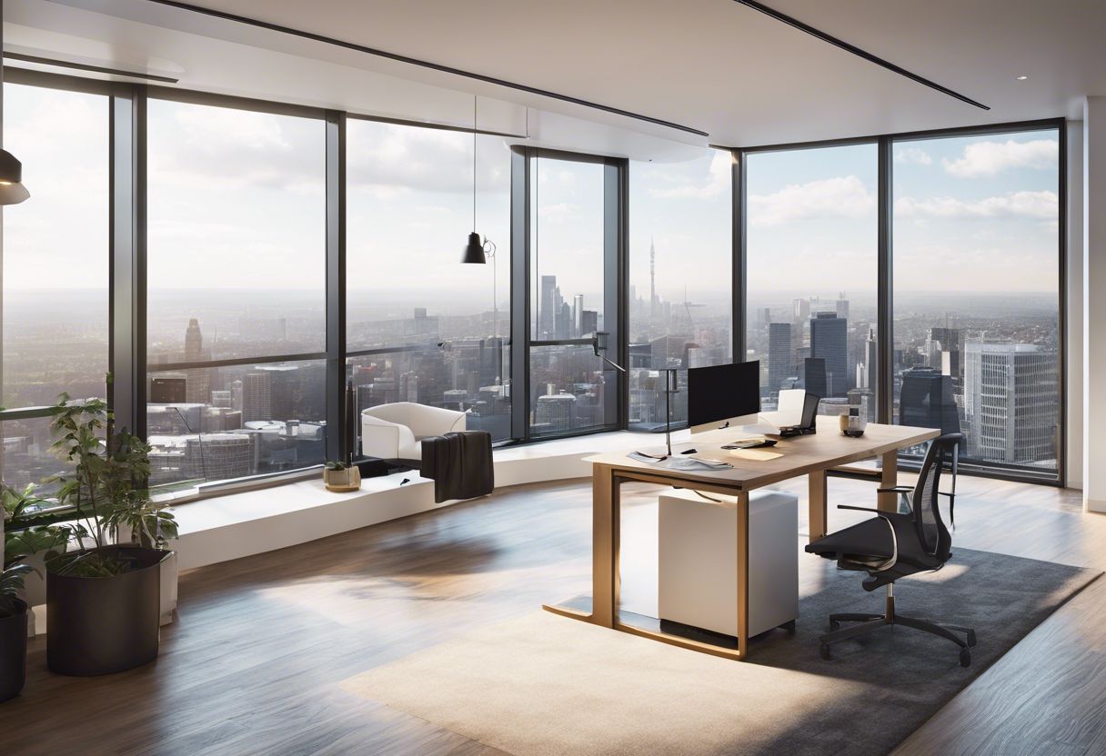
In conclusion, whitespace in web design is a powerful tool that creates elegance and sophistication, leaving a positive impression on visitors. It improves user experience by balancing visual areas and directing attention to important elements.
Utilizing whitespace effectively helps in creating harmony, balance, and improving the overall design appeal of a website. Its clean and minimalist aesthetics are desirable in current web design trends while also making text easier to read.
By strategically using whitespace, businesses can create an aesthetically pleasing and balanced website that enhances user experience and leaves a lasting impact on visitors.
For a deeper dive into ensuring your website’s design maintains its integrity across various browsers, check out our comprehensive guide on browser compatibility.


